Developing with OutSystems
Welcome to the second post in the OutSystems 101 series! The objective of this series is to help developers who use languages and frameworks like React, Angular, or .NET quickly learn core concepts in OutSystems. It’s based on my experience learning OutSystems and “translating” my existing web development knowledge to its visual, low-code language.
If you think low-code is only for non-developers, think again! OutSystems removes the tedium of app development, so you can focus on making strategic technical decisions to build the right app for your users. This post will focus on how to build user interfaces, or UIs, in OutSystems.
I recommend catching up on the first post about data in OutSystems if you missed it. Knowledge of programming concepts is helpful for this series. If you would like a more comprehensive deep dive, OutSystems provides a robust library of training materials for free online here.
Throughout the series, we’ll work through examples based on a sample events platform application. If you’d like to build along, create a free OutSystems account, set up a personal environment, and install the development environment, Service Studio. (Check out the Getting Started guide here.)
UIs in OutSystems
Web developers frequently interact with the concept of components – reusable pieces of code that form UIs. In OutSystems, you can work similarly using Widgets and Blocks.
Under the hood, OutSystems reactive web apps are React applications. This means that there are many overlapping paradigms to modern web development frameworks. If you are already familiar with concepts like reusable components, props or component inputs, the component lifecycle, and reactivity, building OutSystems UIs will feel very intuitive.
Widgets
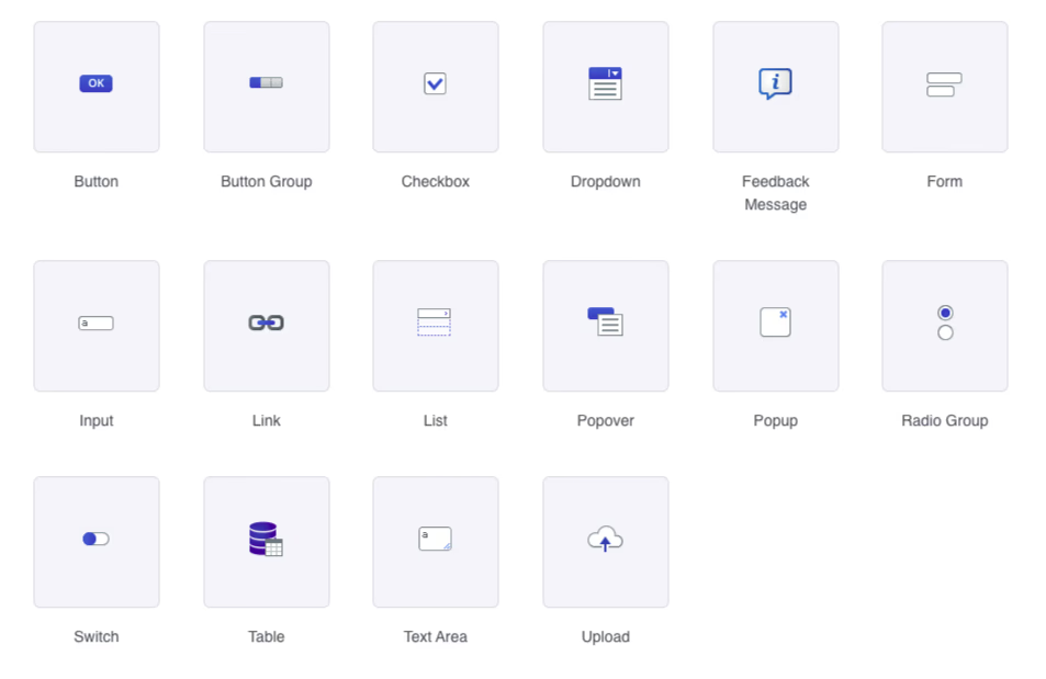
Widgets are the individual elements of a UI in OutSystems. They are the building blocks that you use to create your application's user interface. Examples of widgets include buttons, input fields, images, and more. All the default widgets in Service Studio are from the OutSystems UI Framework, a comprehensive component library.
Adding widgets
In OutSystems 101: Data, we created two screens– a Venues list screen and a Venue detail screen. These screens have a number of automatically-generated widgets, but it’s possible to add more.
You can add new widgets to your screen with drag and drop. You can either drag and drop widgets from the left-hand sidebar onto the screen editor directly or onto the Widget Tree. The widget tree is a visual representation of the widget hierarchy for a screen, with nested levels of widgets.
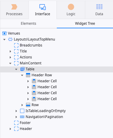
Using the widget tree can make it easier to add new widgets when you have deeply-nested hierarchies of widgets and need to be precise.
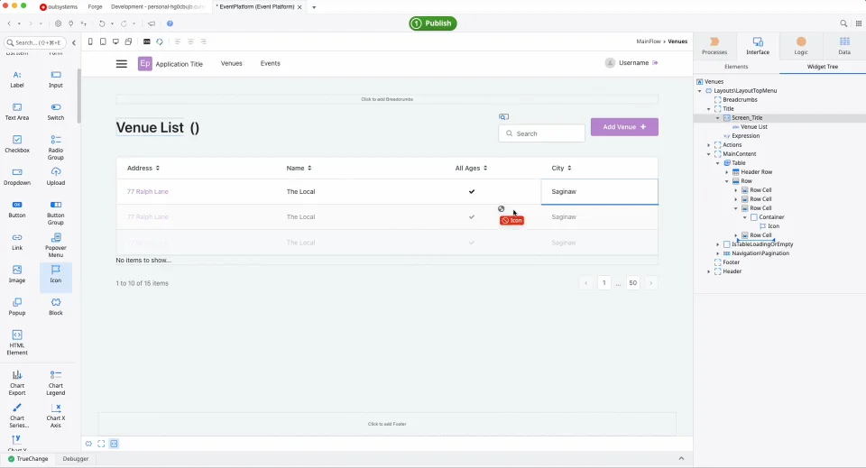
In the left-hand sidebar, there are a number of widgets that are built-in with the OutSystems UI Framework. On the Venues list screen, let’s drag an “Icon” widget to the left of the “Venue List” title on the screen. Feel free to drag onto the screen or the widget tree. I recommend trying both methods to get a feel for which you prefer.
Customizing widgets
Even though widgets are pre-built, you can customize them. Let’s learn how to edit the properties and styles of these widgets.
Clicking on any widget in the screen editor will display the Properties tab for that widget in the bottom of the right-hand sidebar. Let's take a look at the Icon widget we just added.

The Properties tab is where you can update the required and optional configuration details for that widget. The properties will adjust based on the options for a selected widget. Here, you can also apply CSS style classes, set attributes for the underlying HTML element generated, and manage events.
It’s a good practice to give widgets a specific name in the Properties tab. This makes it easier to reference them from other areas of your application. Let’s name our icon “venueicon.” Let’s also change the size property from “2x font size” to “Font size."
There are built-in utility style classes provided by the OutSystems UI Framework. Many of these will look familiar if you’ve used other utility CSS libraries like Tailwind. Here, we can see that the style class “icon” has been applied to this widget.
You can also visually apply styles and add custom CSS in the Styles tab. This tab displays any existing CSS styles, lets you adjust the font, layout, and border without CSS, or add CSS style definitions directly to the element.
Let’s change the font color and select the darker purple from our theme. Let’s also add 10px of right-margin to the icon to give it some space from the title.
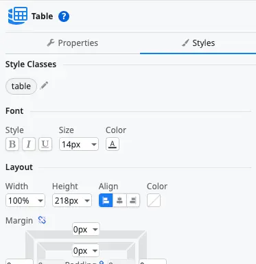
The Properties and Style tabs are where you’ll manage the majority of your individual widget customization. It’s a good idea to check these tabs frequently and become familiar with the available options.
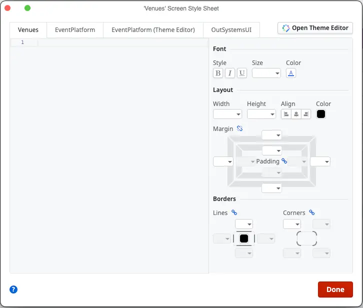
You can also make changes to the overall style of your application. In the toolbar above the screen editor, you’ll find the Style Sheet Editor and the Theme Editor icons. Here you can apply CSS at various levels based on your application, or make changes to the overall theme of your app.
Layouts
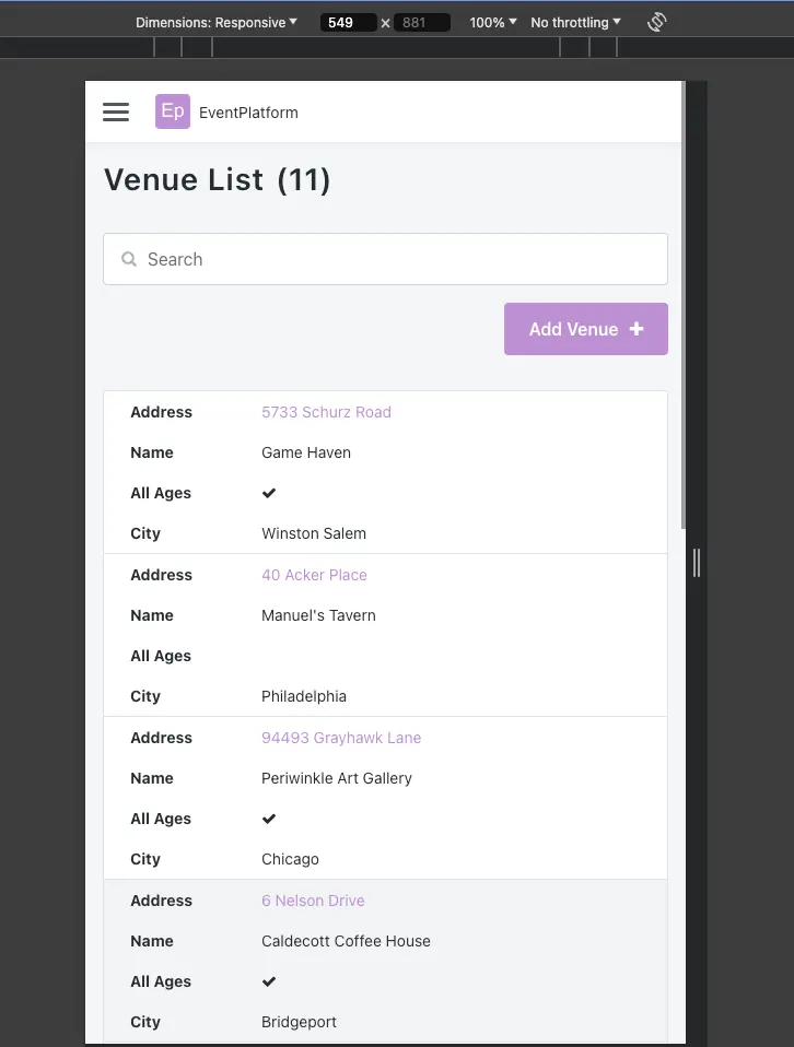
If you open the app in the browser and adjust the window size, you’ll see that OutSystems provides a responsive layout out-of-the-box.
This makes it easy to build a beautiful, responsive user interface. OutSystems uses a column-based layout, similar to frameworks like Bootstrap. Let’s make some changes to our Venue list to make it more interesting. Instead of the table layout, let’s build a UI that has a sidebar with a list of venues that shows more details when a venue is selected.
First, let’s add a Container widget to the main content area of the screen, above the existing table.
Then, delete the table. Make sure not to delete other elements like the pagination or search, but just the table. You can do this via the widget tree, or by clicking anywhere on the table in the screen editor, and then selecting the “Table” from the blue hierarchy options that appear.
Click on the container we just added, and you’ll see a square icon on the right-hand side of the container. This can be used to drag the container and change the width. As you drag, you’ll see columns appear in the background. Drag the right edge of the container to the left to make the container three columns wide.
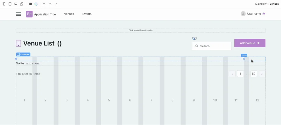
We can do this with any container, making it easy to build layouts in OutSystems.
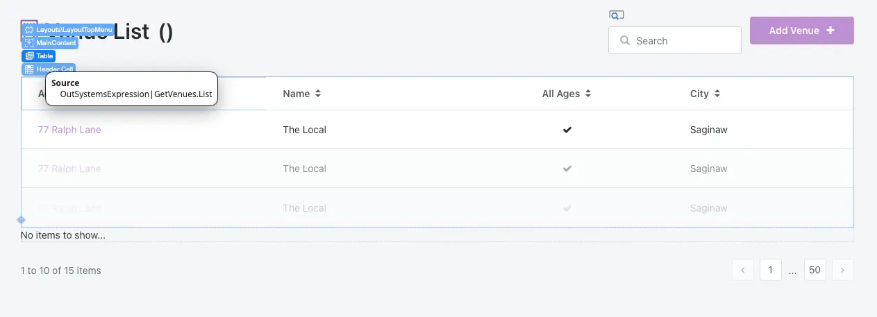
Let’s drag in a List component to display our Venues in this new container. Select GetVenues.List as the Source in the Properties tab. Then drag a List Item widget onto the List. Delete the List Action from the List Item; we won’t be using it.
Drag a Container into the Content section of the List Item (in the middle). Here we’ll use an Expression widget to display the Venue name. If you remember from the first post in this series, we can use Expressions to dynamically display data in our UI.
Drag the Expression into the Container and select or type `GetVenues.List.Current.Venue.Name` in the Expression Editor.

Use the Styles tab to make the text bold. Click the Publish button and open in the browser. You’ll see that you now have a list of Venue names, and have maintained our pagination and search functionality! Because you’re using the same source (our GetVenues aggregate), your other widgets still work as expected thanks to the built-in reactivity.
Blocks
So far we’ve used pre-built widgets. But what if we want to build our own components to reuse across our applications? This is where blocks come in.
Blocks in OutSystems are reusable UI components, similar to components in React, Angular, or Vue. They encapsulate a piece of UI and its associated logic, making it easy to reuse.
Blocks are defined at the UI Flow level. In the Elements list in the Interface tab, you’ll see so far we’ve been working in the “MainFlow” directory. This flow has all the screens we have defined in our app. You’ll see there is also a Common and Layouts directory for those flows. Let’s right-click on the MainFlow folder and select “Add Block."
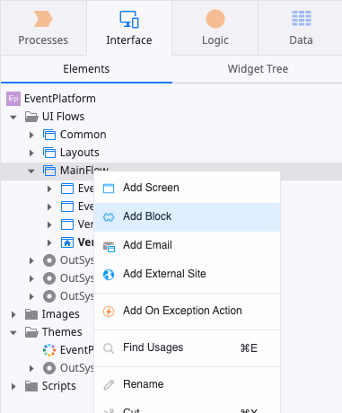
Name the block “VenueDetails." A new screen will appear. This is where we can create the UI elements for our reusable block.
First, we need to define an input parameter for this block. An input parameter is like a prop– it lets us pass data into the component wherever it is used in our app. Right-click on the block, select “Add Input Parameter,” and name it “VenueId." OutSystems will automatically infer the Data Type for this parameter as a Venue Identifier. Like magic!
We’ll also need to get information from our database about the venue based on the Id. Using what we learned in the last blog post about data, we can right-click on the block in the Elements list and select “Fetch Data from Database." Name the new aggregate “GetVenueById."
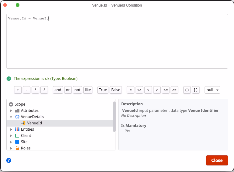
In the aggregate editor, select “Venue” as the source, and create a filter where `Venue.Id = VenueId," with VenueId being the input parameter to the block.
Now we have data to use for our block. Double-click on the VenueDetails block back in the Elements list to return to the block editor.
Drag a container onto the screen. Inside this container, we’ll use an Expression to display the venue name again with `GetVenueById.List.Current.Venue.Name` in the Expression editor. Let’s also display the address, city, state, and zip code. Play around with the widgets and Expression Editor, as well as the styles, to get the look you like.
Finally, we’ll use an If widget to display if the venue is for all ages. Drag an If widget onto the screen. You’ll see that a “Condition” property is required for the If widget. This is the condition that is checked and, if true, will display the content in the “True” section of the block. If false, the content in the “False” section of the block will be displayed.
Set the Condition to `GetVenueById.List.Current.Venue.AllAges` (it should be the first suggestion provided by OutSystems). In the “True” section of the If widget, add text that says “All Ages," and leave the “False” section blank.
When you’re done, the block should look something like this.
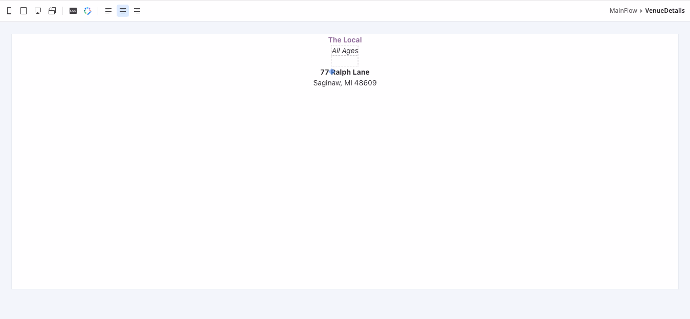
Note: As a bonus, see if you can use the Maps widget with the Google Maps API to show a map of the venue location!
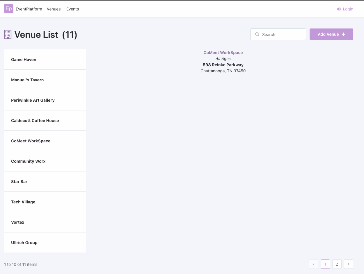
Once our block is complete, we can use it back in our application. Navigate to the Venues list screen and create another container next to our existing column of Venue names. It should automatically fill the width of the remaining nine columns.
Then, drag the VenueDetails block onto the container. OutSystems will highlight the block in red because the block requires the VenueId input parameter. For now, use the Expression editor to set it to “IntegerToIdentifier(5).” We’ll update the real functionality of this block in the next blog post!
Publish your app and in the browser we’ll now see the block displaying the venue details! Congratulations, you have learned how to use widgets and blocks in OutSystems to build a UI.
Next steps
This has been a crash course on UIs in OutSystems! I encourage you to use the free OutSystems personal environment to create an app and explore these UI concepts yourself. OutSystems is best learned hands-on due because it’s visual.
Stay tuned for more posts in this series – the next covers logic.
Sign-up for your free personal environment and get started today.


